Thursday, December 18, 2014
Monday, December 8, 2014

Wednesday, November 26, 2014
Surrealism Project
 |
A.Weaver
|
Tuesday, November 25, 2014

Thursday, November 20, 2014
Surrealism Project
For my surrealism project I want to create an image of a
girls mind. I want to capture make-up, shoes, handbags and everything else that
a girl thinks about. I want a girl’s forehead to be on the bottom and all
around her is the make-up and stuff.
Wednesday, November 19, 2014

Surrealism
Rene Francois
Ghislain Magritte was born on November 21, 1898 in Lessines, Belgium. Rene is well known for his number of thought-provoking
images that is known as surrealism. Rene
began lessons in drawing in 1910. From 1916 to 1924 he studied at the Académie
Royale des Beaux-Arts in Brussels. In 1926, Rene produced his first surreal
painting. The painting was named Le jockey perdu or The Lost Jockey and was
held in his first exhibition in Brussels. The critics were cruel on his exhibition
and that led to failure. After moving to Paris he became a leading member to a
surrealist group. In 1930 he returned to
Brussels working advertising. In 1936
his worked was exhibited in New York. One was at the Museum of Modern Art in
1965, and the other was at a Metropolitan Museum of Art in1992. Rene died of
cancer on August 15, 1967 at the age of 68.
Erik Johansson was
born in 1985 in a small town called Gotene in the middle of Sweden. At the age
of 15 he received his first digital camera and having an interest in computers
made him want to play around with photos so he could create something that he couldn’t
capture with a camera. He studied
Computer engineering at Chalmers University of Technology. Erik published one
of his photos and received request to work for local advertisement agencies.
Erik is currently working personal and off commissioned projects and in 2011
started street photography. Erik has worked with well-known brands such as
Google, Adobe, and Microsoft.
.jpg)
Artist’s Name ___ Rene Francois Ghislain Magritte ___
Title of Artwork _The _Victory_ ___________________
Date of Work _1939_____________________________Description: The Facts identify everything in the art work: (Objects, Lines, Shapes, Textures, Values)
An open door is on the beach while
a cloud is floating the air coming out from the door.
Analysis: The Design Determine how the artwork is organized
or composed. (Balance, Lights/Darks, Focal Point, Rhythm, use of Layers, Color
enhancements, special effects)
This
image has a balance of light where the center is lighter than the whole image
where it breaks up the sky from the ocean. The focal point is the cloud because
it stands out with the color being used. The cloud is the whitest and it draws
your attention.
Interpretation: The Meaning Explain what you think the
artwork means or what the artist is trying to communicate:
My interpretation
of the artwork is that Rene wanted to show you another side to a door. When the
door is shut you only see what is happening in the inside, but if the door is
open you allow yourself to see something that wasn’t once there. The cloud represents
allowing yourself to let something into your life while the beach is a reminder
of how you should be free and relax.
Judgment : Make a personal decision about the artworks
degree of success and an example of why you feel the way you do.
This
image in my opinion is very successful. It is well done with the technique of oils
and the shading in the sky. The sand is well done as well and really captures a
beach. The water looks like it is
flowing with the streaks of white.

Artist’s Name __Erik_Johansson_____________
Title of Artwork _The_Cover_Up_____________Date of Work __2014______________________
Description: The Facts identify everything in the art work:
(Objects, Lines, Shapes, Textures, Values)
It is a man on a step stool putting up “wallpaper” to cover
up the grey sky.
Analysis: The Design Determine how the artwork is organized
or composed. (Balance, Lights/Darks, Focal Point, Rhythm, use of Layers, Color
enhancements, special effects)
The
balance of light and dark is shown in the sky. In the center you see a bright
sky while on the right side you see a dark grey sky and how deserted it is. The
creator used layers to show the rolls of wallpaper and how he is hanging them
up. He merged two photos together to get the light and dark images in one.
Interpretation: The Meaning Explain what you think the
artwork means or what the artist is trying to communicate:
I think
the creator’s meaning behind this image was that with all the bad in your life
you need to block it out and give yourself a better day. The rolls of wallpaper
are shown so that he could cover up all the bad and let the light shine
through.
Judgment: Make a personal decision about the artworks degree
of success and an example of why you feel the way you do.
I think
Erik’s creation is maleficent. He did a well job of capturing his images and
merging them all together and I like the added detail. I like how he added the
curves in the wallpaper that is being hung up but still kept the grey beneath
it. I like how the wallpaper on the
ground is turned in all directions where you see the bottom.
Comparison
Although both of these images are surrealism they have
different style. In both images they are well thought out. Erik uses Photoshop
to merge images and create one amazing picture while Rene used oil to create an
image with objects you don’t picture all together. Erik’s Photoshop skills
allows him to merge pictures to get a final picture while Rene had to plan out
and paint them to make it look as if the door is really on the beach. I think both creator created amazing photos
that is nice to look at. Thursday, November 13, 2014
Photo Book


Wednesday, October 29, 2014

Object Series
 |
A.Weaver
|
Friday, October 24, 2014
Famous Painting Parody
 |
"American Gothic; Grant Wood" A.Weaver
|
Tuesday, October 21, 2014
Artistic Inspirations
 |
Florian Ritter
|
 |
Kat Von D
|
 |
Terry Richardson
|
Terry Richardson is a well-known photographer who has taken photos of some of the biggest celebrities. I like this photo because it portrays my favorite model Cara Delevingne being herself.
 |
Patrick Demarchelier
|
 |
Henri Cartier-Bresson
|
Sunday, October 19, 2014


Thursday, October 16, 2014

Friday, October 10, 2014

Thursday, October 9, 2014
David Hockney Inspired Collage
 |
A.Weaver
|
In order to create this photo I first had to choose a scene.
I decided on the tree in the back of my house and took about 30 photos. I
uploaded them to the computer and started to Photoshop my images. I started in
the left corner and simply copied and pasted each individual photo. I wanted
the photo to line up so each image went right next to the other photo. Once I
liked the arrangement I added an effect to make the photo brighter and I was
done.
 |
A.Weaver
|
In order to create this photo I first had to choose a mode. I
decided on my sister and then took about 25 photos of her standing against a
blank grey wall. I uploaded them to the computer and started to Photoshop my
images. I started with her eyes and then worked my way around her face. I
played around with different pictures I took and once I liked the arrangement I
edited the contrast the make her lighter.
Monday, October 6, 2014

Saturday, October 4, 2014
Where I Rather Be
 |
| "Where I Rather Be" A.Weaver |
Friday, October 3, 2014
Parnter Portrait
 |
"Partner Portrait" A.Weaver
|
Monday, September 29, 2014
Reflection Photo
 |
A.Weaver
|
Saturday, September 27, 2014
Photo Walk
 |
| A.Weaver |
Wednesday, September 24, 2014

Thursday, September 18, 2014
Portrait Series
 |
Self Portrait Series A.Weaver
|
Friday, September 12, 2014
Photography Composition
 |
Angle Straight Ashley Weaver 2014
|
Angle (straight) - Camera is pointed forward.
This image is an example of “Angle Straight” which is
when the image is straight in front of you. While standing on another
playground I faced the camera straight out in front of me and shot this image.
 |
Angle Up Ashley Weaver 2014
|
Angle (up): Camera is facing up
This image is an example of “Angle Up” which is when the
camera is being pointed up. This image was photographed while lying on the
ground and looking up at the sky.
 |
Soft Focus Ashley Weaver 2014
|
Focus (soft): an image, often created by a special lens that
is recognizable but somewhat blurred or diffused.
This image is an example of “Focus
Soft” which is an item being photographed and one part of the image isn’t being
blurred. This image was taken outside my house. The blurriness was added using Photoshop.
 |
Leading Line Ashley Weaver 2014
|
Focus (sharp) - Sharpness is how much blurriness a photo
has.
This image is an example of “Sharp Focus” were the leaves
are brought out and the center of focus.
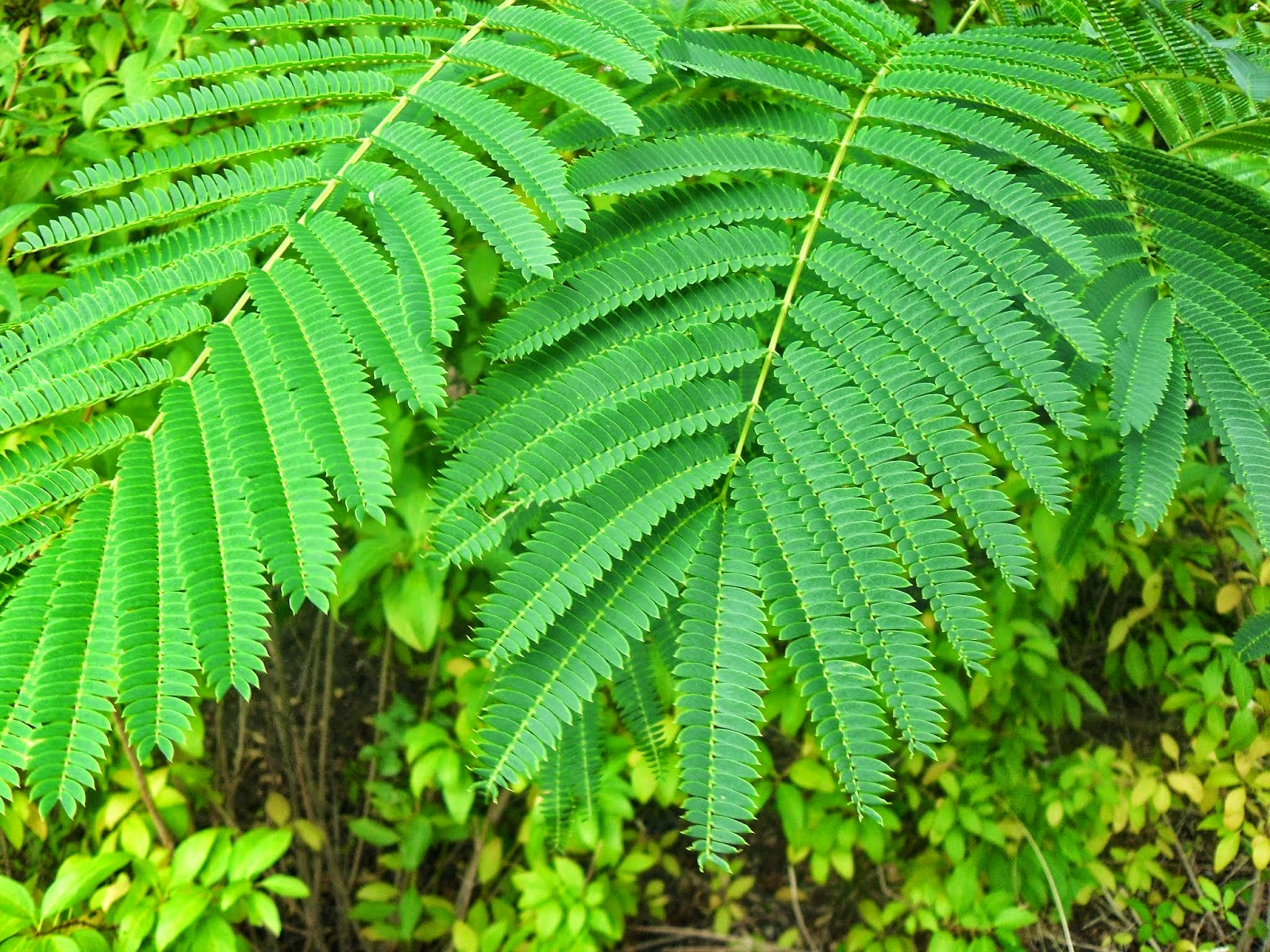 |
Sharp Focus Ashley Weaver 2014
|
Focus (sharp) - Sharpness is how much blurriness a photo
has.
This image is an example of “Sharp Focus” were the leaves
are brought out and the center of focus.
Monday, September 8, 2014

Subscribe to:
Posts (Atom)